Calendly
2022-Present
As a marketing graphic designer at Calendly, I am responsible for large-scale design efforts, such as product launches, ebooks, event branding, video artboards, social campaigns, and more. I also work to ensure that all designed collateral is on brand.
JUMP TO:
ANNUAL COMPANY EVENT
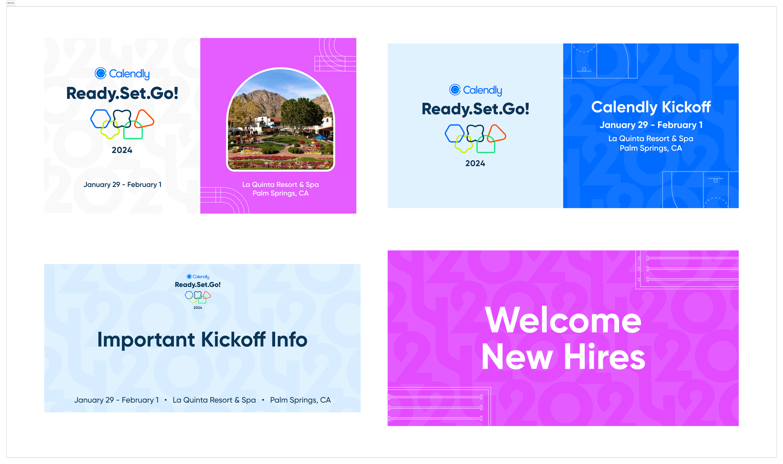
Calendly Kick-Off (CKO), January 2024
For Calendly’s annual in-person meeting in Palm Springs, we decided to pay homage to the Olympics (also occurring in 2024), with the tagline “Ready.Set.Go.” to energize employees to kick-start the new year.
To develop the branding, the design team worked on several rounds of brand exploration, including logo iterations, testing color palettes, illustration and iconography, and swag ideas. We were responsible for producing and shipping designs for stage layout, video artboards, emails, on-site branding, flags, and more!


ANNUAL COMPANY EVENT
Calendly Retreat, January 2023
For Calendly’s first company get-together in Palm Springs, the design team ideated on several themes that would incorporate both the location and the company goals in the new year. Inspired by JFK’s “We Choose to go to the Moon” speech, we landed (no pun intended!) on the “Ready for Liftoff” space theme.
In the months prior to the event, we came up with a dozen themes that were pitched to the executive team. Once the final theme was chosen, we built out the style guide and all of the collateral: presentation template, video artboards, roll-up and wayfinding banners, interface UI and patches for custom bomber jackets, and more.


Email Redesign and Templatization Project
Calendly’s email templates were in need of a refresh. As the lead designer on the project, I gathered inspiration and researched component styles. I then built out a style guide, modules, and templates in Figma allowing the email team to self-serve export to Braze.
Template Examples
STYLE GUIDE
A/B Testing Results
Early stage A/B testing of the new banner, with branded shapes and a cleaner, more seamless design, provided a 3-4% higher conversion in two tests. The results were not statistically significant but are directional.
Early stage A/B testing of the webinar template found that the old version received 18K clicks while the new version received 23K unique clicks (roughly 25% more total clicks). Both versions had roughly the same unique click-thru rate, however the new template, received significantly more total clicks.
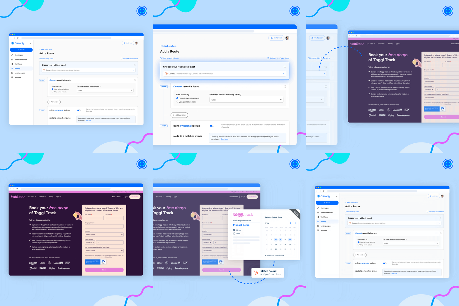
Extension Redesign Product Launch
Selection of designs I worked on and used by Calendly to inform and educate users on new features included in a product launch.
video storyboards
In collaboration with a team including a Multimedia Producer, Creative Director, and animation agency, I designed artboards with motion directions that followed a story script and were used by animators to create a long-form promotional video. Watch the full video below!
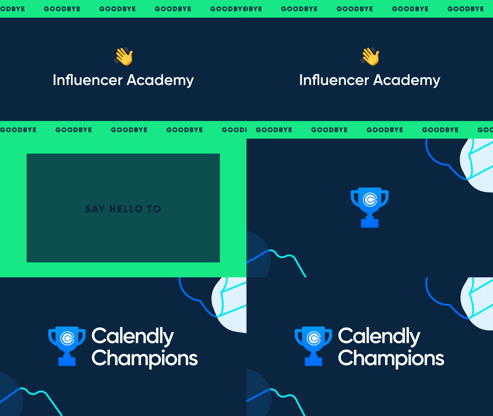
Animation Work
Various projects that I designed and animated. Most have been shared on Calendly’s social media channels.


![Battling-browser-clutter,-one-tab-at-a-time-[copy] (1).gif](https://images.squarespace-cdn.com/content/v1/5cb2202de8ba4413f69d978b/1721408698575-YVLZ0HFX20IA6ZH90VFI/Battling-browser-clutter%2C-one-tab-at-a-time-%5Bcopy%5D+%281%29.gif)

The Art of Cold Outreach Ebook
The Calendly content and solutions marketing team wrote a forty page ebook together with Gong, Sendoso and over a dozen collaborators. I was tasked with taking the content and creating an engaging, readable and beautiful document to be shared widely with sales teams and individuals.
ABM Ad Templates and Testing
In collaboration with the Demand Gen (DG) team, we implemented a revamped creative testing strategy for Account Based Marketing (ABM) ads, focusing on creative. DG and Design developed Standard (Control) Ads and put those to the test against our Inspo (Test) ads, which incorporated a new layout and overall design scheme.
I created the new templating for the Inspo (Test) ads in 14 sizes. We tested using bright colors, framing and bold sizing of text and imagery. Find out the results below!
INSPO (TEST) AD TEMPLATE ExampleS - 1200 x 1500 PIXELS
A/B Testing Results
The strategy involved serving gated content (On Demand Webinars/Guides) to our target buyer personas, measuring success based off of which group had the higher CTR. For this tactic on LinkedIn, the benchmark CTR we were aiming for was 0.44%.
The data shows that the direction to revamp our ad designs was successful, as the new ‘Inspo’ versions exceeded the benchmarks and outperformed the control versions with a 20% increase in CTR in most cases.
© 2019–2024 Ruthie Greenblatt


