
Calendly
Company Rebrand

Brand preview (image by Smith & Diction).Project Overview
Role: Senior Marketing Graphic Designer
Deliverables: Figma component libraries, Brand UI system, refreshed marketing assets
Timeline: 7 months
Credits: Amanda Norris, Meg Oliphant, Smith & Diction
Calendly went through a major rebrand in partnership with Smith & Diction. Early in the process, I joined an introductory session with the agency to share perspective from inside the brand: what was working, where the existing identity created friction, and what I wanted to see improve in a new system.
As the new identity came together, I helped bring it into the day-to-day design practice at Calendly. Working alongside the small internal design team, I helped build the new brand system in Figma, translating the identity into a structured, flexible set of tools used cross functionally across the organization.
We established the core visual system as a clean, organized set of Figma component libraries, making everything from foundational styles to reusable components easy to find, maintain, and apply consistently.
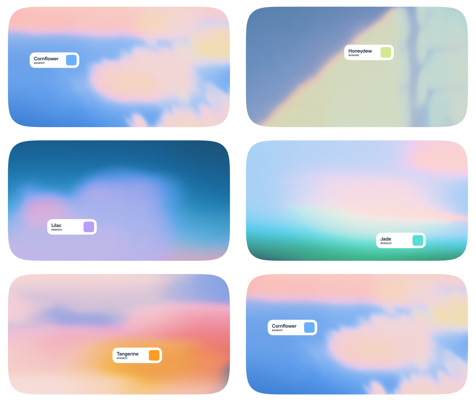

Expanded color palette categorized by tone into Figma variables. 
Avatar component library.
The avatars were built to be scalable across the design system and with multiple background options: gradient, solid color or natural environment.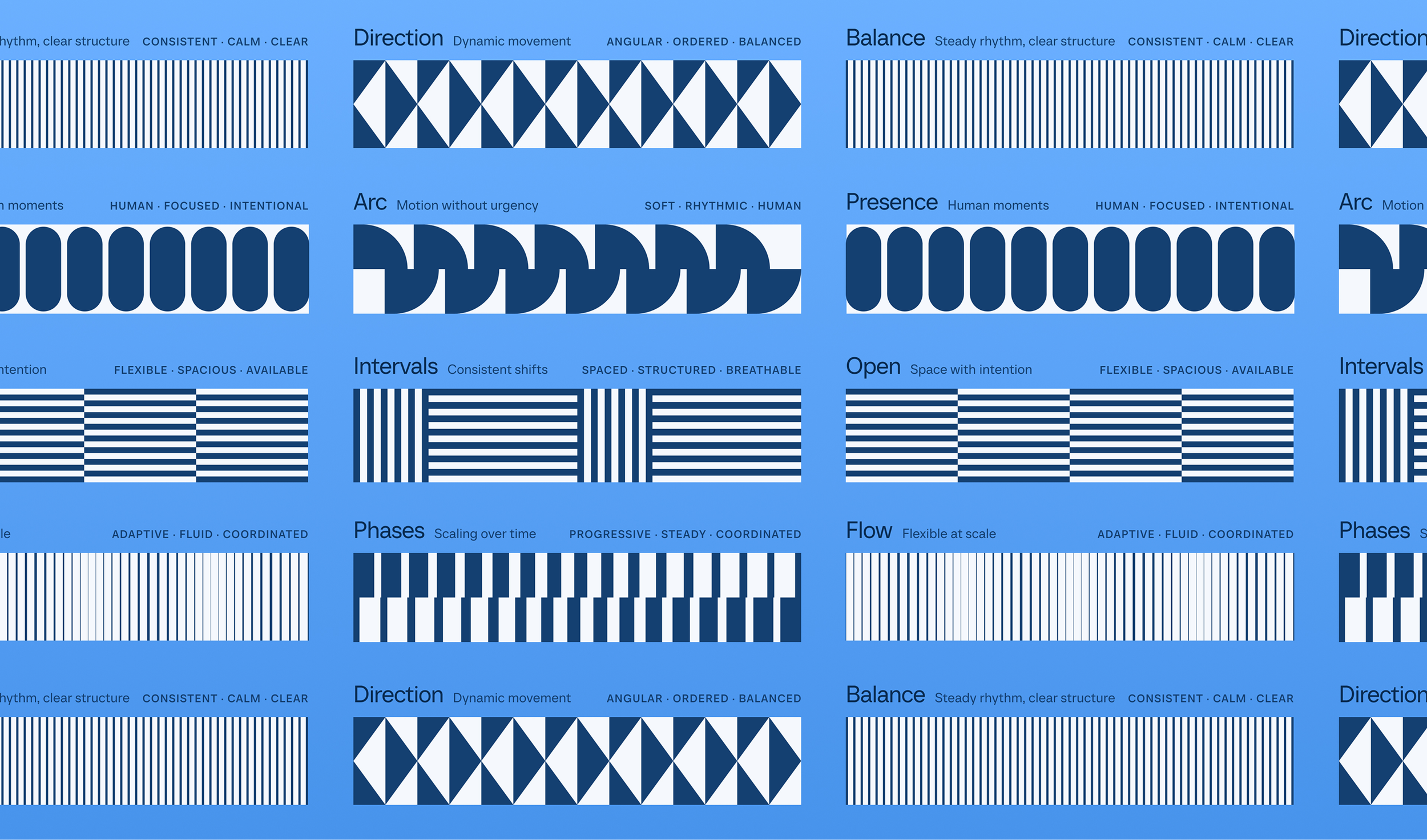
Patterns library (image by Smith & Diction). We built them into Calendly's Figma as a component library. Developing a Brand UI library
Alongside the broader brand system, Amanda, Meg and I created a product-focused UI component library that brought the new visual language into market-facing interface design. These components, built from atoms then developed into molecules, provide the team a starting point for building marketing materials with a consistent visual language.
The goal wasn't to just recreate the new brand in Figma. It was to make the brand into a usable system that could support different teams, projects, and surfaces without requiring constant reinvention of the same visual concepts.

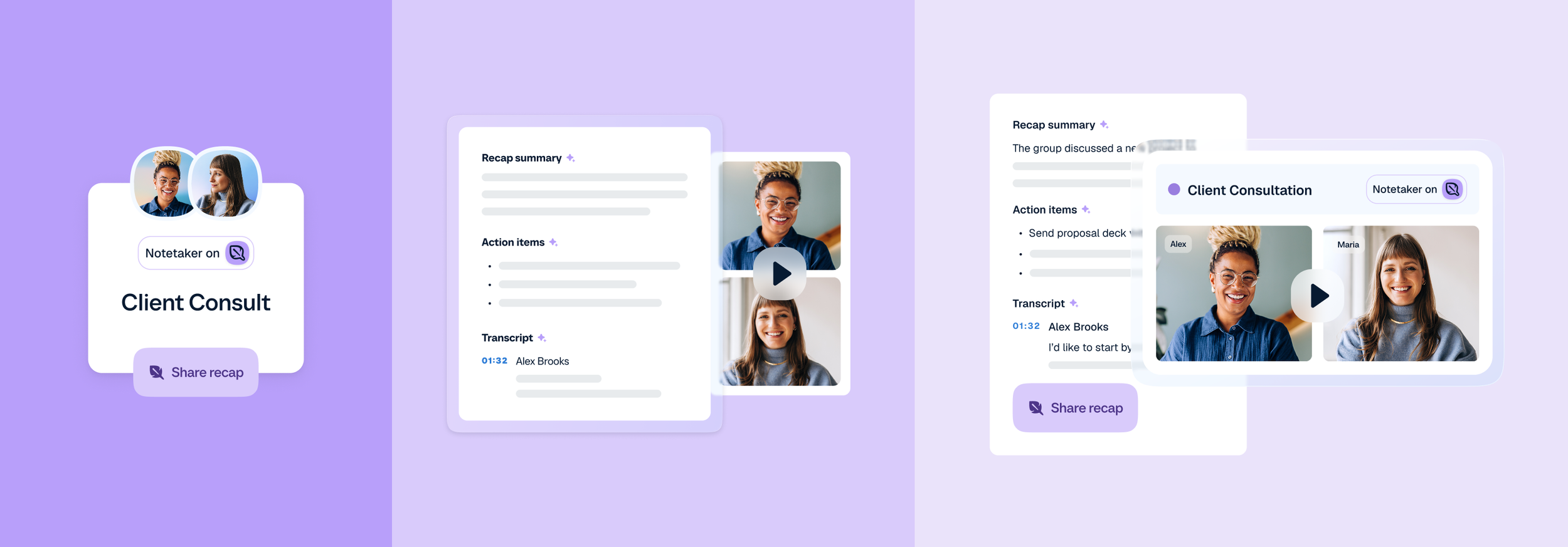
Email header using brand UI components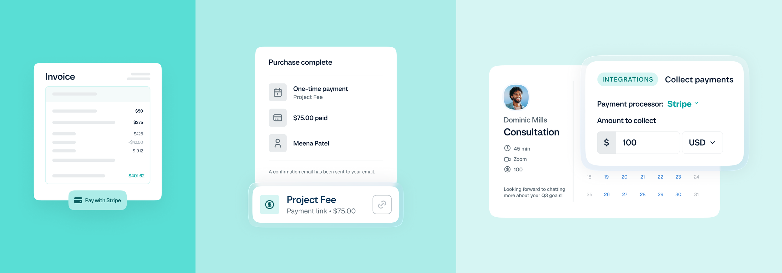
Brand UI molecules in low, medium and high fidelities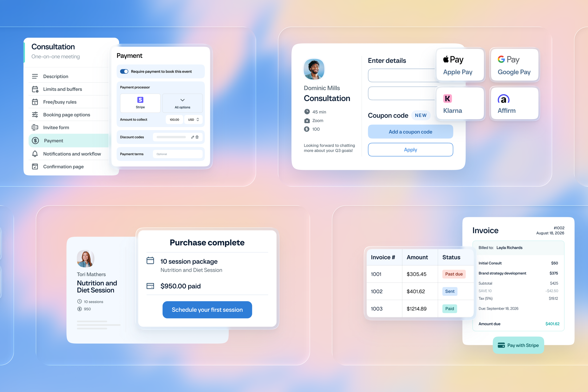
Extension listing imagery using brand UI componentsBringing the brand to the world
Beyond building the system, I helped carry the new identity across the many places the Calendly brand shows up.
This meant refreshing existing branded materials and visual touch-points to align with the new identity, ensuring the brand felt cohesive not just within our design files, but across the broader ecosystem of experiences that customers and partners encounter.
It was a large-scale exercise in applying the new system consistently while also making thoughtful decisions about how the brand translated across different contexts and formats.

Crop of video intro. Animation by Isaac Maltzer.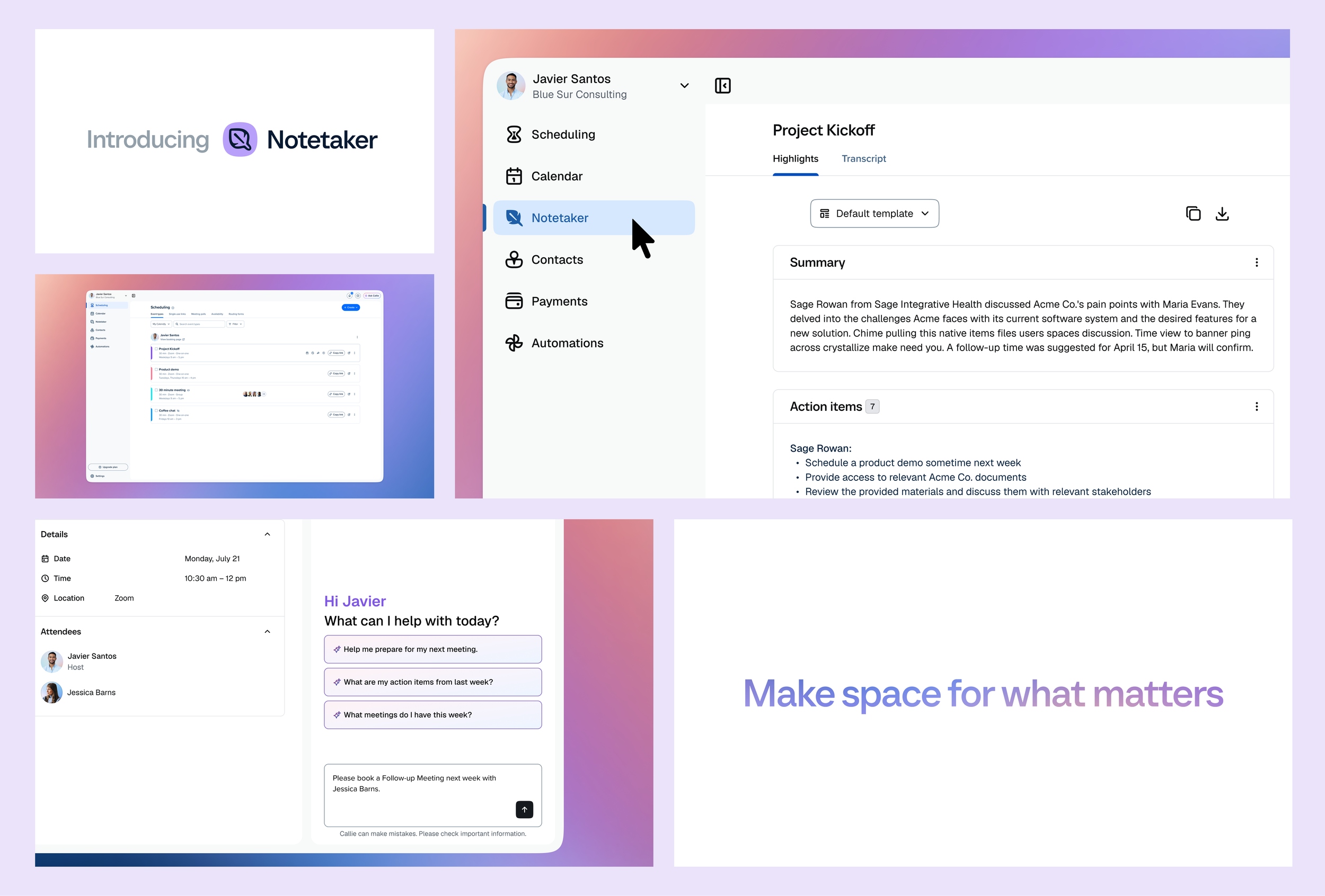
Select artboards designed for the Notetaker video.